
can someone show me what the bubble maps looks like on the @bubblemaps token?
same company that calls out distribution on every token that does well btw.... https://t.co/0HqUbNjv0I
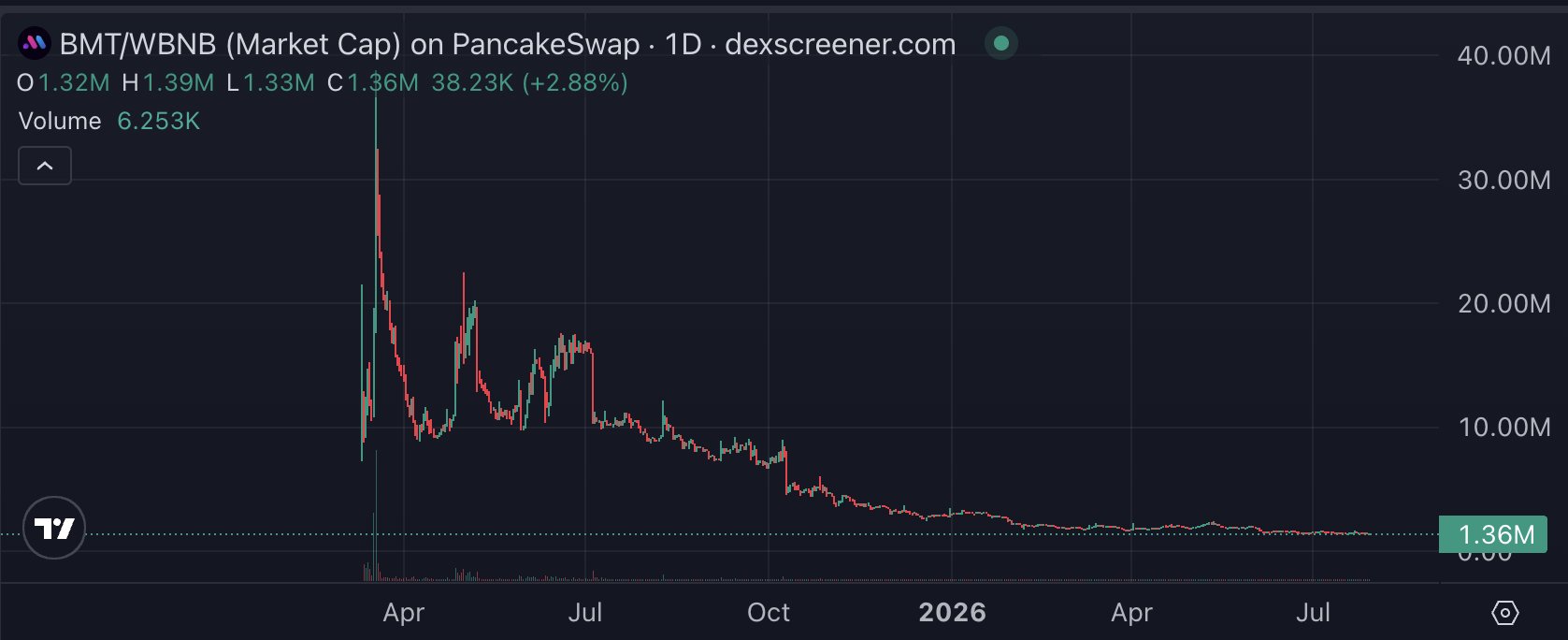


 37.1K @alpha_co
 can someone show me what the bubble maps looks like on the @bubblemaps token?
same company that calls out distribution on every token that does well btw.... https://t.co/0HqUbNjv0I
 37
37
 13
13
 3.2K
3.2K
 11.9K @MiCryptoMundo
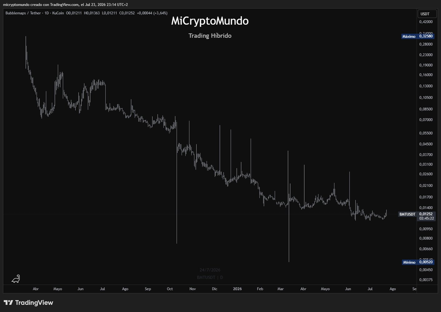
 What a terrible chart Bubblemaps $BMT has https://t.co/qoF74xnvoo
 280.9K @bubblemaps
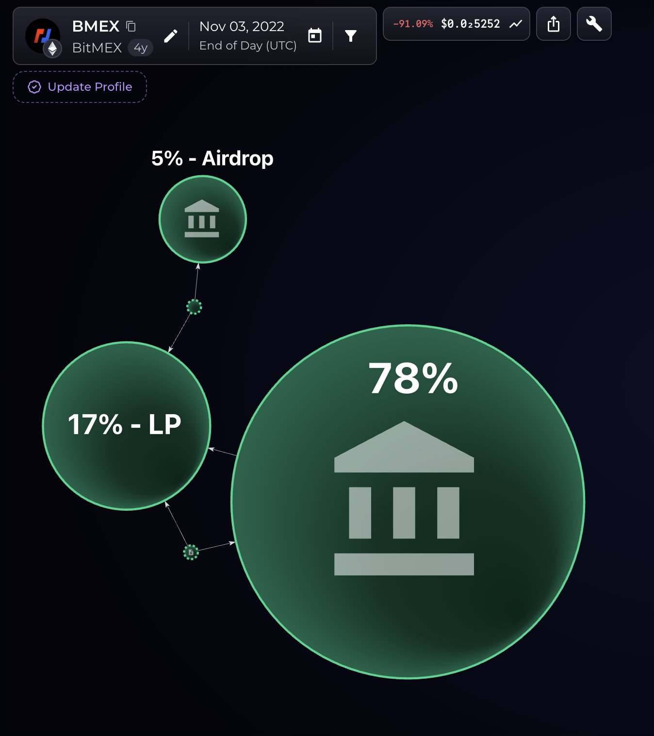
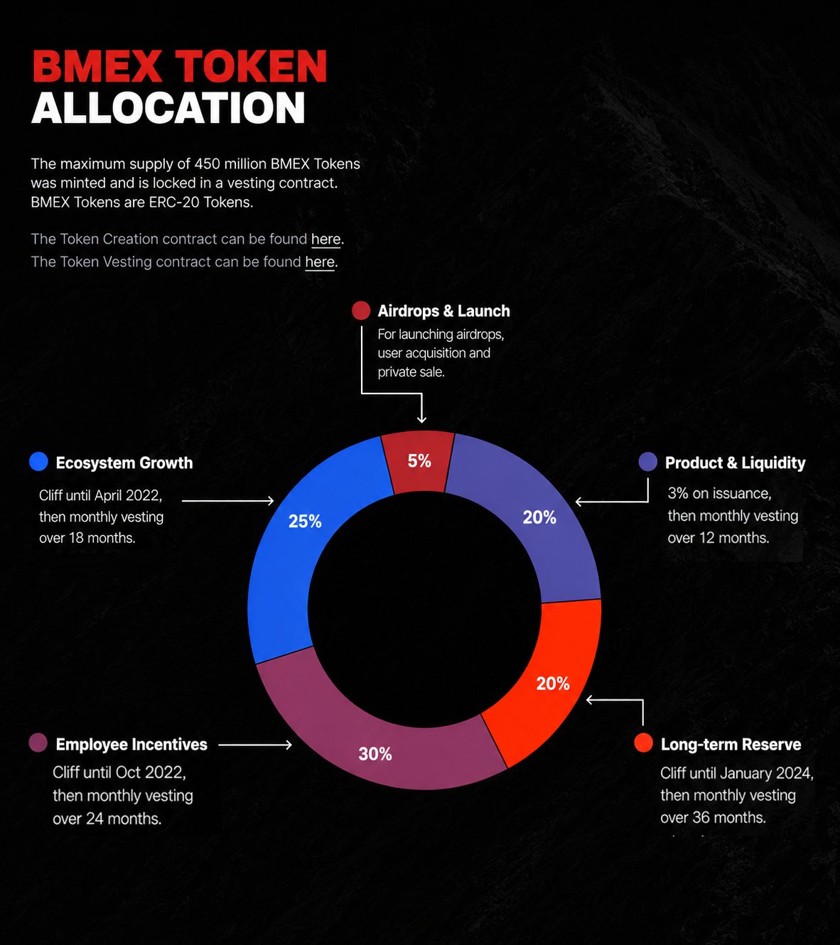
 BitMEX is shutting down
75% of $BMEX was meant for employees, ecosystem, and reserves
It was never distributed 🧵 https://t.co/DmcmrZGdnf
 4
2
1.1K
4
2
1.1K
 30.6K @MastrXYZ
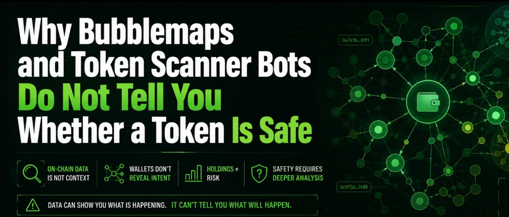
 Why Bubblemaps and Token Scanner Bots Do Not Tell You Whether a Token Is Safe;
Bubblemaps and automated token scanners can be useful as a first filter.
The problem is that many traders treat a colourful cluster or a green security score as the result of an investigation, when it is merely the starting point.
Bubblemaps shows connections between wallets, but it cannot explain what those connections mean.
A cluster might represent insiders, bundled supply or several wallets controlled by the same person.
It might also come from a legitimate presale, migration, airdrop, staking contract, treasury distribution, bridge, exchange or liquidity transfer.
This is especially relevant with older tokens, where years of normal transactions can create patterns that look suspicious without having anything to do with the original launch.
Even a shared funding source proves very little on its own.
Presale participants may receive tokens from the same distribution wallet or claim contract.
Buyers using the same exchange, launchpad or bridge may also appear connected.
What matters is the full context: where the funds originated, when the wallets were created, whether they bought within the same block, whether the allocations matched disclosed presale terms and whether the wallets later transferred or sold in coordination.
Automated scanners have similar limitations.
They can detect obvious technical risks such as mint or freeze authority, unlocked liquidity, extreme taxes, blacklist functions or honeypot behaviour.
They usually cannot determine whether insiders control dozens of apparently independent wallets, whether the presale was manipulated, whether vesting can be bypassed or whether the available liquidity could absorb even a fraction of the largest holders selling.
Scammers also know exactly what these tools check.
They revoke authorities, distribute supply across hundreds of wallets, lock a small liquidity position and route funding through exchanges, bridges or intermediary addresses.
The token then receives a reassuring score because it was specifically structured to pass the automated test.
This is why real analysis requires more than looking at bubbles.
You need to classify burn addresses, liquidity pools, contracts, market makers, exchanges, treasury wallets and presale allocations correctly.
You need to examine deployer history, vesting, liquidity ownership, wallet funding, launch timing, coordinated buying and actual selling behaviour.
A map can show you where to investigate. It cannot give you the conclusion.
My criticism of Bubblemaps also goes beyond the limitations of the tool.
They launched their own $BMT token despite already having a functioning product, and I saw no convincing reason why the ecosystem required it.
The launch raised serious questions about connected wallets, insider participation and aggressive profit-taking, followed by roughly $3.4 million being removed from the market value.
I asked direct questions about the structure and transparency of the launch. Instead of answering them, they blocked me.
There were also other situations where Bubblemaps amplified or indirectly promoted questionable tokens and narratives, including around $NEIRO.
I am not going into every private conversation or interaction with sleuths from that period, but a company that has built its reputation around exposing hidden incentives should be held to the same standard when its own token or preferred projects are involved.
They have also promoted several scams in the past, by the way. I still have the screenshots if anyone is interested.
That does not make Bubblemaps useless.
The product itself can be valuable when used by someone who understands what the data can and cannot prove.
But neither Bubblemaps nor any scan bot should be treated as neutral, complete or infallible.
The visualisation may be accurate while the interpretation is completely wrong.
And frankly, in the current market, I assume almost every newly launched token that reaches more than $250,000 in market cap is non-organic until proven otherwise.
In perhaps 99% of cases, that valuation is supported by bundled supply, coordinated wallets, insider money, presales, paid promotion, market makers, artificial volume or a controlled launch designed to manufacture the appearance of demand.
Real communities do not appear within minutes, and thousands of independent buyers do not accidentally discover the same unknown token at the same time.
The market cap displayed on the screen may technically exist, but the market behind it usually is not organic.
 30.6K @MastrXYZ
 I thought it was worth explaining that proper on-chain and social analysis still cannot be fully automated.
These tools may show you a third of the story at best.
The rest requires context, experience and hours of actual investigation.
Perhaps this will help people understand how much work goes into a proper check, and maybe a few will finally realise why a green score or a colourful map is nowhere near enough.
30.6K @MastrXYZ Feel free to add your own ideas, corrections, questions or anything I may have missed in the replies.
70
12
4.6K
