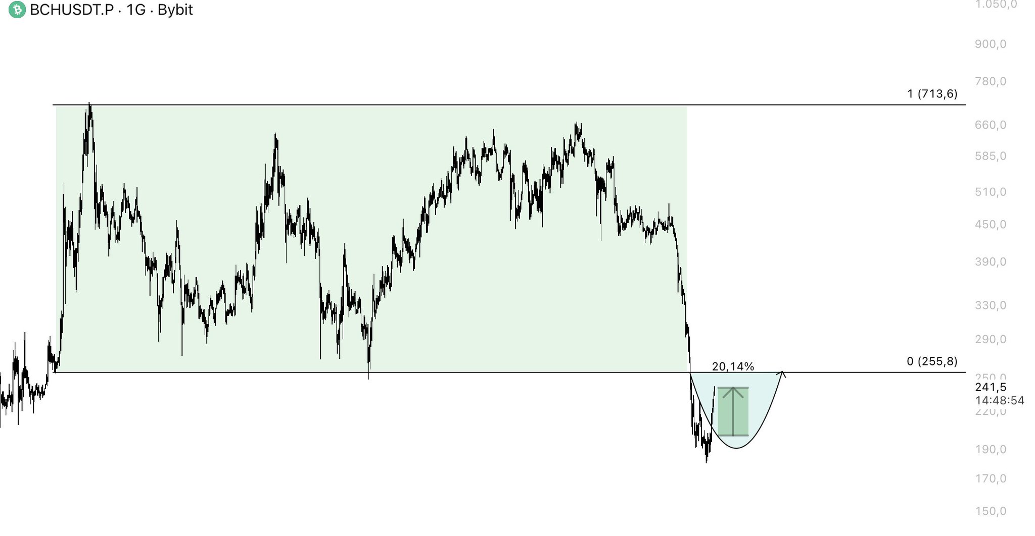
$BCH +%20 ✅
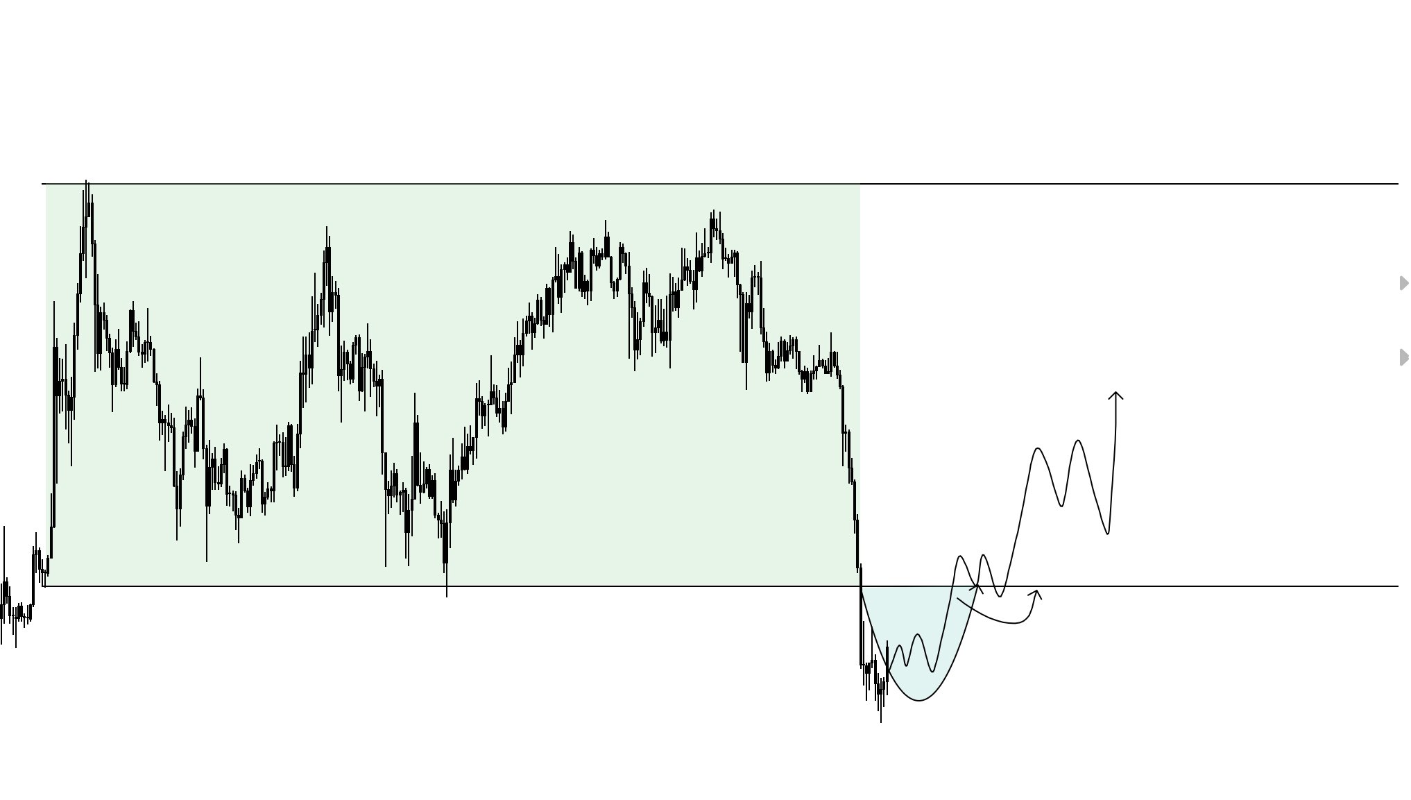
If the $255 level is reclaimed, the lower region will likely remain nothing more than a liquidity sweep.
This will be an important chart to watch in the coming period. https://t.co/UM2tV2lmGB


 37.2K @LSTraderCrypto
 $BCH +%20 ✅
If the $255 level is reclaimed, the lower region will likely remain nothing more than a liquidity sweep.
This will be an important chart to watch in the coming period. https://t.co/UM2tV2lmGB
37.2K @LSTraderCrypto Which #altcoin pair is this PO3 setup from?
Come on, LSTRADER followers let’s see who the real ones are in the comments. Who will be the first to guess it correctly? https://t.co/robhBb8vnh
 77
77
 6
6
 4.6K
4.6K
 5.1K @PunkChainer
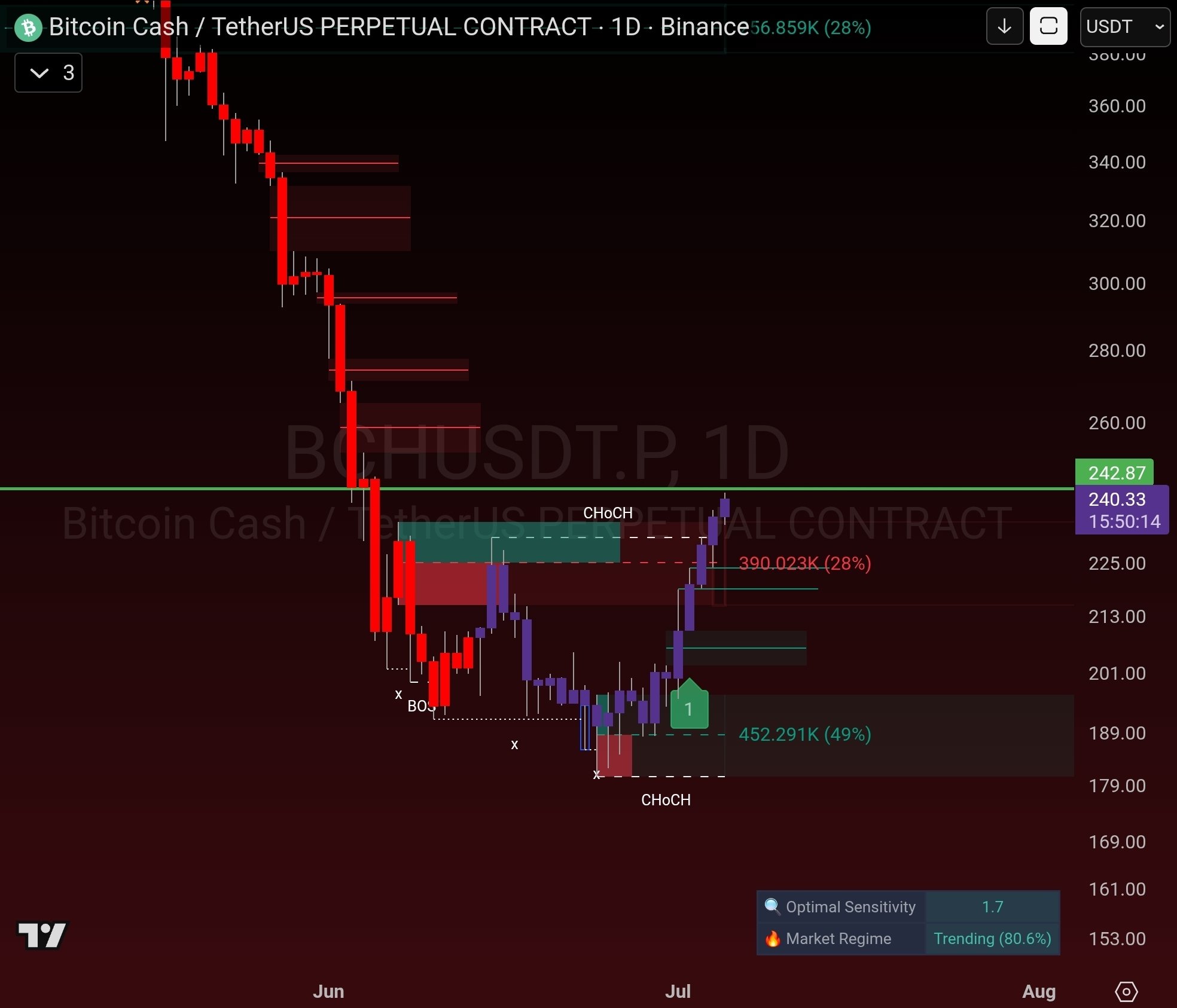
 🔴 I have gone short on BCH again.
The structure remains the same. To me, this bounce continues to be a relief rally within a larger‑time‑frame downtrend.
I was already positioned before and have used this move to reinforce the position.
Now it’s a matter of patience and letting the market do its work. We’ll see if it finally goes after the lows I’ve been mentioning these days.
📉 #BCH #BitcoinCash #Crypto #Trading #SmartMoney
👉 https://t.co/TSybYWz3MA
 7
1
346
5.1K @PunkChainer
7
1
346
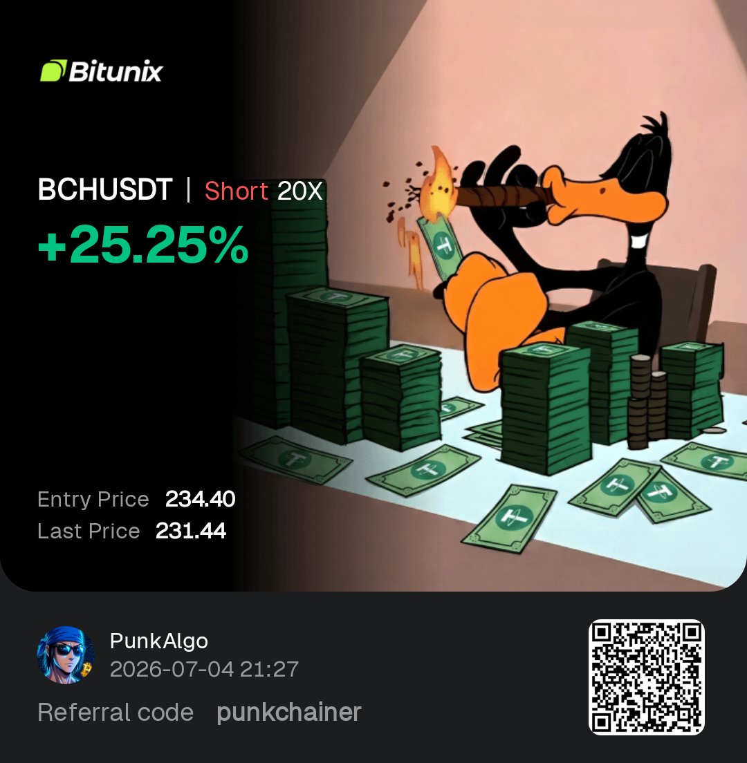
5.1K @PunkChainer SHORT on BCH closed with profit. ✅
While many chased the rally, we saw the rejection, executed the plan, and took the move.
In trading, the winner isn’t the one who trades the most. It’s the one who waits for confirmation and executes without emotion.
The market always leaves clues for those who can read liquidity.
How many were long while we took profits? 👀
🔗 Join the community: https://t.co/TSybYWz3MA
#BCH #BitcoinCash #Bitcoin #Crypto #Trading #SmartMoney #PriceAction #PunkAlgo
 9
2
1.1K
9
2
1.1K